![]() R. Craig Collins >Common
> Fonts and Graphics
R. Craig Collins >Common
> Fonts and Graphics
Computer Graphics and Typed Characters © R. Craig Collins, 2005/19
Topics:
How Monitors create images
To Typed Characters
ASCII - Unicode
Anti-aliasing
Bonus Reading: Web Page Considerations
Graphic Formats for the web
gif
jpg
png
Bitmapped/Raster vs. Vector
Image Layers
How Monitors Create Images
There are two real concepts in computer graphics, and they both deal with
how a computer represents a line that used to be drawn on paper.
The earliest attempt at this concept is how a TV screen 'draws' pictures. If
you look carefully at a TV, you see the image is actually made up of tiny dots
of color, called pixels. ![]() The proximity of certain dots of light are then interpreted by our eyes as lines
and solid shapes.
The proximity of certain dots of light are then interpreted by our eyes as lines
and solid shapes.
The term for this simple collection of dots is bitmapped. Originally computer
screens were very much like typewriters, and could only create predetermined
shaped like letters on the screen.
But as the technology improved, it was decided to mimic TV and represent letter
shapes by a series of dots, and if you could represent a letter, you could also
represent other kinds of shapes and computer graphics were born.
You could now display a picture, or print out a picture, instead of just words.
Bitmapped means that each pixel has a value assigned to it, which is translated
by us as the shape or color. So 111000111 might darken some pixels on the monitor
like this ![]() , or
from a distance it might look like - -.
, or
from a distance it might look like - -.
Raster images are where the shades of an image are converted to 1s and 0s at
the place where the shapes covers a particular pixel.
But the problem with this is when you try to magnify the image. A diagonal line
like \ may look fine, until it is 10 times larger, and suddenly looks like a
staircase.
![]()
It was never really smooth, so magnifying it makes things worse.
The solution for this is was to stopped describing a line with dots, and instead
describe a line with a line, or at least a formula that was understood by the
computer to represent a line. That is tell the computer a line starts at the
second pixel on the first row, and runs at a 35°
angle to a particular pixel on the 68th line.
What was nice about this is that formulas can be manipulated to magnify the
line without jagged edges.
Typed Characters (Fonts)
And since a letter of text on a screen could be described with formulas for
circles and lines, we could now have scalable text, as with True Type Text.
![]()
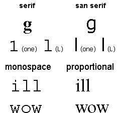
A little bit about text shapes on computers, usually called fonts.
This includes the font face, or, the shape of a letter and if it has got extra shapes to help you read it (called serif)or no extra shapes (called san serif)
the size of the letter, measured in points... 72 points in an inch
the color of the letter
the attributes of a letter, such as bold and/or italic.
Another consideration is the spacing of letters, where it is mono space or proportionally spaced.
See illustrations below
So, a font is
actually a collection of information, such as Times
New Roman (a proportional spaced serif choice) could be Black, Bold+Italic, and 12 pt. characters.
(There are 72 points to an inch; so 12 pt is 1/6 of an inch high letters, measured
from the highest point that any letter reaches, to the lowest possible point.
Such as the top of an 'h', and the bottom of a 'y'.)
Some letters have extra doodads called serifs, which give a letter more shape,
making it easier to read. A serif 'g' is a lot less likely to be read as a 'q'
that the Sans serif version of a 'g'.
Originally computers used seven 1s and 0's to represent about 128 different shapes, or letters to display on the screen.
Example: 'A' was 100001 and 'a' was 110001.
Today, the Open True Type fonts use
Unicode, sixteen 1s and 0s, which can represent tens of thousands of different shapes, to include not only English, but Russian, Japanese, Arabic, etc.
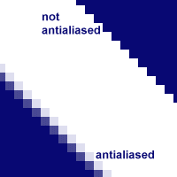
A final note, while True Type fonts improve scaling and display, the monitor
is still a series of dots... limiting the ability to display smooth curves.
This can be overcome to an extent, using partial shading of pixels to simulate
smooth lines and curves... this is called anti-aliasing.
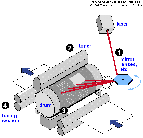
Finally, for the words and images to be printed, a ink jet printer sprays ink
onto paper, using magnets to guide the ink. Laser printers use a laser to change
the magnetic properties of a rolling drum where words are to appear; the magnetic
toner sticks to the drum until paper passes under it, where the toner is transferred
to the paper, and set with heat by a fuser.
Bonus Reading Web Page considerations
One a web page, these attributes are controlled with the some formatting tags
and the <font> tag set, such as
<font size="3" face="arial"><b><I>
some text </I></b></font>
Also, there are two options for the spacing of the letters... the difference between
Times Roman and Courier for most systems. The default for Word processing and
web pages is the easier to read proportional Times. Courier is the mono-space
option, like a typewriter, and is set with <tt> or <pre>. Mono-space
adds extra white space around letters, making it harder to read, and is often
avoided.
(<pre>, or preformatted, also 'reads' line breaks, tabs, and spaces in text.
<tt>,
or TeleType simply uses the mono-space font the browser has available.)
More details on the <font>
</font> tag set, from my Web Page Design class.
Graphic formats for the web
In computer images, different tools work in different ways to represent a line.
Most computer graphics are created on the monitor just as you would on paper...
dots of color that when viewed from a little distance look like lines and shapes.
The technical term for this is a raster image. A raster based program usually
creates files like Windows bitmaps (.bmp), Tagged Image File Format (.tiff),
or the web usable .gif or .jpg. The latter two formats work well on the Internet
because they are both compressed, meaning they take up less space than the equivalent
bitmap. However, neither format scales well, so they can be difficult to magnify.
gif
The Graphic Interchange Format, or .gif, is very well suited for line drawings
and solid colors, where as .jpg is well suited for photographs that have a lot
of blended colors and indistinct lines. One of the ways that .gif files stay
small is that they are limited to 256 colors. For a time, graphic editors were
required to pay to use the patented gif format, but that patent has since expired.
When Internet connections were slower, .gif files were interlaced, meaning that
not every line of the image downloaded in sequence. A rough approximation might
be that on the first pass at 'drawing' a .gif, only every other line was downloaded,
and then the rest of the image was 'drawn' on the second pass. Thus, the image
started to display quickly, but was not clear until the entire file had downloaded.
A variant of .gif is called .gif89. This variant supports transparency as a
'color,' and also supports cartoon style animation.
Many people suspect that gif will be surpassed as the format of choice for simple
line drawings by png, but that has yet to happen, especially since the .gif
patent has expired.
jpg
The Joint Photographic Experts Group, or .jpg (or. jpeg) format is well suited
for photographs that have a lot of blended colors and indistinct lines, where
the .gif is very well suited for line drawings and solid colors. The .jpg format
allows files to be compressed by actually taking out part of the image. As the
human eye cannot really distinguish between the subtle changes of a 4.3 billion
tone rainbow that can be generated using 32 bit (232) color, simply
storing color information for every pixel using 24 bits (224), or
16.7 million colors (which hex can
represent) may suffice... making the file smaller, while not really changing
the way the file 'looks.' You may compress a file further by going to 16 bits
(216), or 65536 colors, or even less. Further, you may reduce resolution,
making the image a little less crisp, to reduce a .jpg file's size... Many graphic
editing programs can compress, or 'optimize,'
files so that they look good, but take up less space for web delivery.
png
The png, or Portable Network Graphics format, was designed to replace .gif,
by supporting up to 48 bit (281 trillion colors), so that an image losses no
information to compression, unless the user wishes to compress it, allowing
the format to be used for both an original, and then a web appropriate format.
It has however, not really gained a lot of support for the time being.
Bitmapped/Raster vs. Vector
While .jpg or .gif are well suited to monitor only deliver, as the monitor after
all is just a bunch of dots, they may not print well, or scale. Just as True
Type fonts replaced the old bitmap fonts, there is a move to stop defining pictures
as simply a flat surface with dots on it. Vectors are formula based images that
manipulate shapes in three dimensions, meaning you can move a shape around.
Try moving a part of a printed picture... it really can't be done.
An example of a vector is a.wmf file, that clip art in Office that can grow
and shrink without losing information about the shapes that were used to build
the image. Unfortunately, these images don't work on the Internet, so must be
converted from the vector format to a raster format. Even worse, once converted,
an image cannot be changed from a raster to a vector very well. So a rule of
thumb is, convert a copy of your file, so you still have the original.
Illustrator is one of the more popular vector editors.
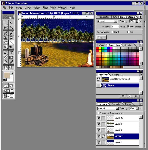
Image Layers
One of the ideas that can be borrowed from vectors and used while editing raster
images is the idea of working in three dimension. Thus the really big difference
between a simple bitmap program such as Pain, and a full featured editor such
as Photoshop is layers.
This is similar to drawing one part of an image on a clear transparency, an
then another part of the picture on a different transparency. That way if you
want to erase part of the drawing, it doesn't necessarily mess with the other
part.
When viewed together, they form a complete image which can then be 'flattened'
and then turned into a .jpg or .gif. Note the image below is comprised of several
layers, visible at the lower right.
A few tips
Tips on backgrounds
and images for web pages.
You can only use .gif or .jpg files, others must be converted (perhaps by using
GIMP)
You may right click on an existing image on another web page, and choose Save
Picture As...
or you may right click on a background image, and choose Save Background
As...
but please remember copyrights!
You may search for images on most search engines, or try www.Corbis.com.
Background images should be in the background, so avoid patterns or colors that
will interfere with the text on the page... and note that background images
smaller than the window will tile to fill the screen. If you can't find any
backgrounds you like, you can check out my Creating
Backgrounds page.